



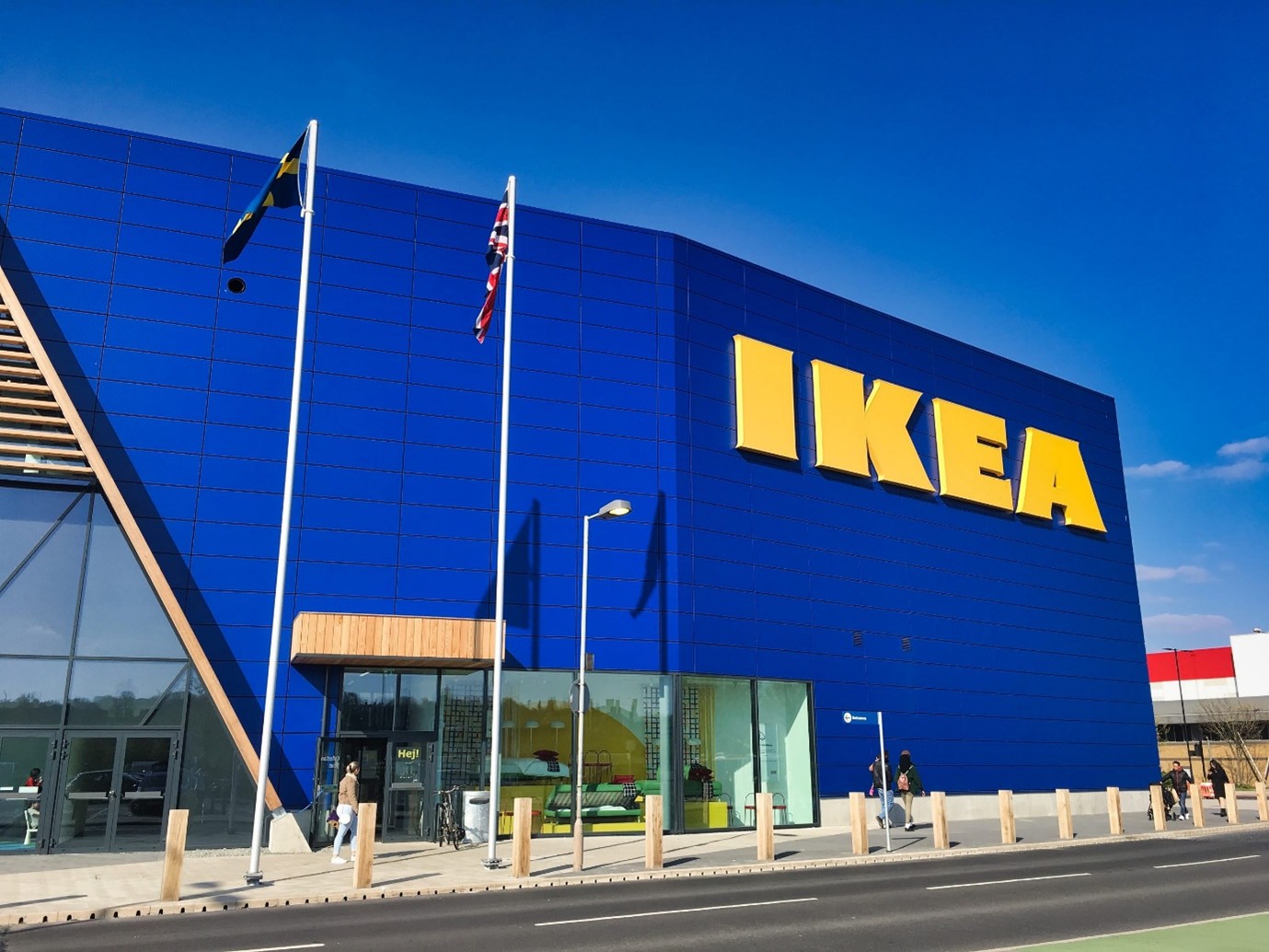
In the world of retail, few companies have mastered the art of guiding a customer journey quite like IKEA. Every visit to an IKEA store feels intentional: you enter, follow a carefully curated path, discover inspiration, make decisions with confidence, and leave feeling satisfied, even if you buy t-lights and a office plant although going to by a new sofa.
But what if your website could do the same thing?
For B2B companies, especially manufacturers, guiding website visitors is critical. Your prospects are busy, your products can be technical or high-investment, and first impressions matter. By combining the IKEA-inspired approach with E-E-A-T (Experience, Expertise, Authoritativeness, Trustworthiness) principles, and factoring in AI search and zero-click behaviour, you can design a website that leads users through a purposeful journey, just like IKEA leads shoppers through its showroom.
In this article, we’ll explore what IKEA teaches us about website UX and E-E-A-T, how to translate IKEA’s store experience into digital UX, why it matters for B2B lead generation, and practical ways to map your own website journey.
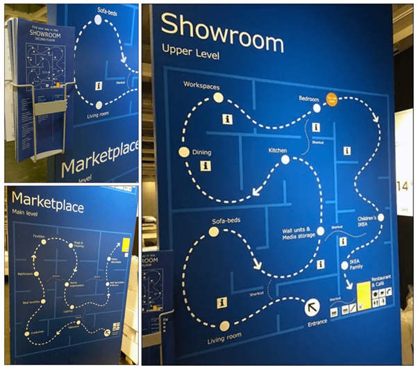
When you walk into IKEA, there is only one entrance. You cannot skip straight to the warehouse or checkout (unless you know the shortcuts). You are gently guided along a path that shows you fully furnished rooms, demonstrates products in context, and builds your understanding of what is possible.
Website parallel
On a B2B website, your landing pages are the “entrance.” Whether your visitor arrives via Google, LinkedIn, or a referral, your homepage, service pages, or targeted landing pages should:
In short, design your website to teach and inspire before pushing a sale.
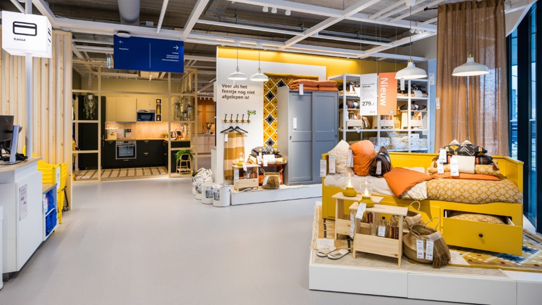
IKEA doesn’t bombard shoppers with product codes and dimensions at first glance. Instead, it immerses visitors in a lived experience: a kitchen that looks like a home, an office that feels functional, a bedroom that inspires.
Website parallel
For manufacturing or B2B buyers, experience is demonstrated understanding:
This builds experience credibility, demonstrating you understand your audience before asking for a lead.
Shoppers never feel lost at IKEA. Signage, arrows, and logical product flow reduce decision fatigue. Staff are on hand if needed, but the path itself conveys expertise.
Website parallel
Expertise on a B2B website is demonstrated by:
The goal is simple: make complex information easy to navigate. Expertise is not just content; it’s flow.
IKEA’s global brand communicates authority without shouting. From the catalogue to signage, from product labelling to online presence, the messaging is consistent, reassuring, and confident.
Website parallel
For B2B manufacturers:
Authoritativeness ensures that when a prospect searches for solutions, your website is recognised as a credible source essential in high-consideration industries.
IKEA anticipates doubt and addresses it proactively: returns policies, measurements, staff assistance, and transparent pricing reduce friction and anxiety.
Website parallel
Trust signals on a B2B website include:
Trustworthiness reassures prospects that working with your company is low-risk, which is crucial for complex B2B purchases.
A practical way to apply these lessons is through digital journey mapping, just as IKEA plans its store layout.
[Landing Page] -> [Industry Insight / Case Study] -> [Product Solution] -> [Configurator / Quote Request] -> [Contact / Consultation]
This linear yet flexible flow mirrors IKEA’s physical route: prospects can explore, but the default journey nudges them toward conversion.
AI-powered search is changing user behaviour. Many B2B buyers now consume content directly from search engines, PDFs, or snippets without visiting your website. Here’s how to adapt:
Essentially, your website becomes an IKEA-inspired “digital showroom” even if visitors don’t enter the front door.
Manufacturers face unique challenges: complex products, long sales cycles, and highly informed buyers. IKEA-style UX, combined with E-E-A-T, addresses this by:
The outcome? A website that doesn’t just inform but actively nudges prospects toward meaningful engagement, making your sales team’s job easier.
Treat your website like IKEA treats its store: every touchpoint is intentional. Every page, CTA, and piece of content should be part of a curated journey that:
Think in paths, not pages. AI search behaviour and zero-click experiences make this more important than ever.
Yes. Even a modest website can benefit from clearly defined flows, case studies, and guided CTAs. The key is intentionality, not scale.
Use session recordings, heatmaps, click-through rates, conversion rates, and AI insights. Look for drop-off points and iterate to smooth the journey.
Map your current content against buyer stages, identify gaps where users get lost, and redesign your navigation and CTAs with a logical, IKEA-like flow.
AI prioritises structured, authoritative, and relevant content. A journey-focused website signals topical authority and ensures your content is surfaced even in zero-click results.
Absolutely. Detailed case studies, interactive calculators, configurators, and guided content sequences all demonstrate expertise and reduce friction for technical decision-makers.

Warren Albutt is Managing Director of M4M, a UK-based agency specialising in digital marketing for manufacturers and B2B businesses.
With over 25 years of experience in international marketing and a deep understanding of lead generation strategies, Warren helps companies translate complex products into clear, engaging digital experiences that drive results.